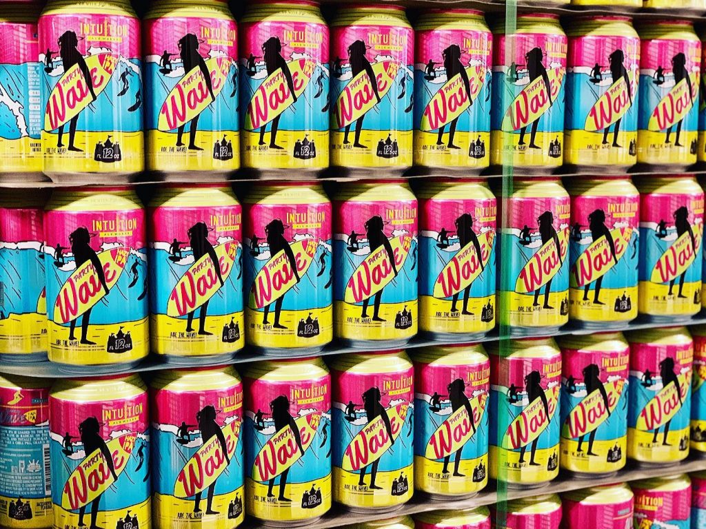
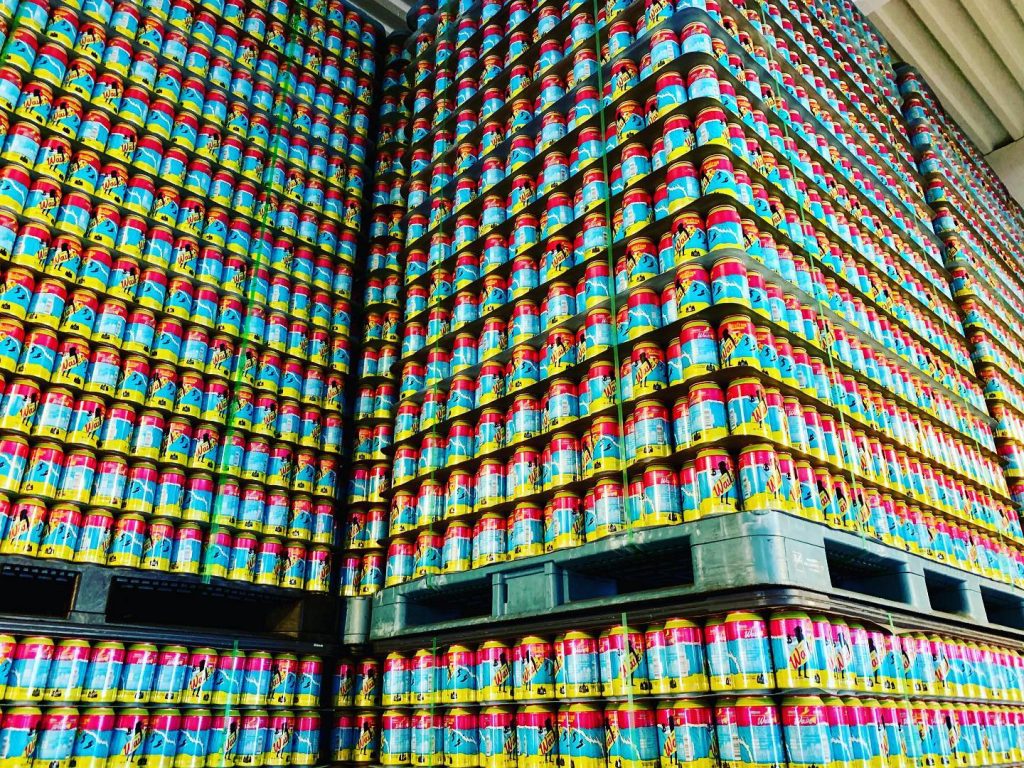
Over 150,000 of these are sitting in Intuition's production space.
The Decision
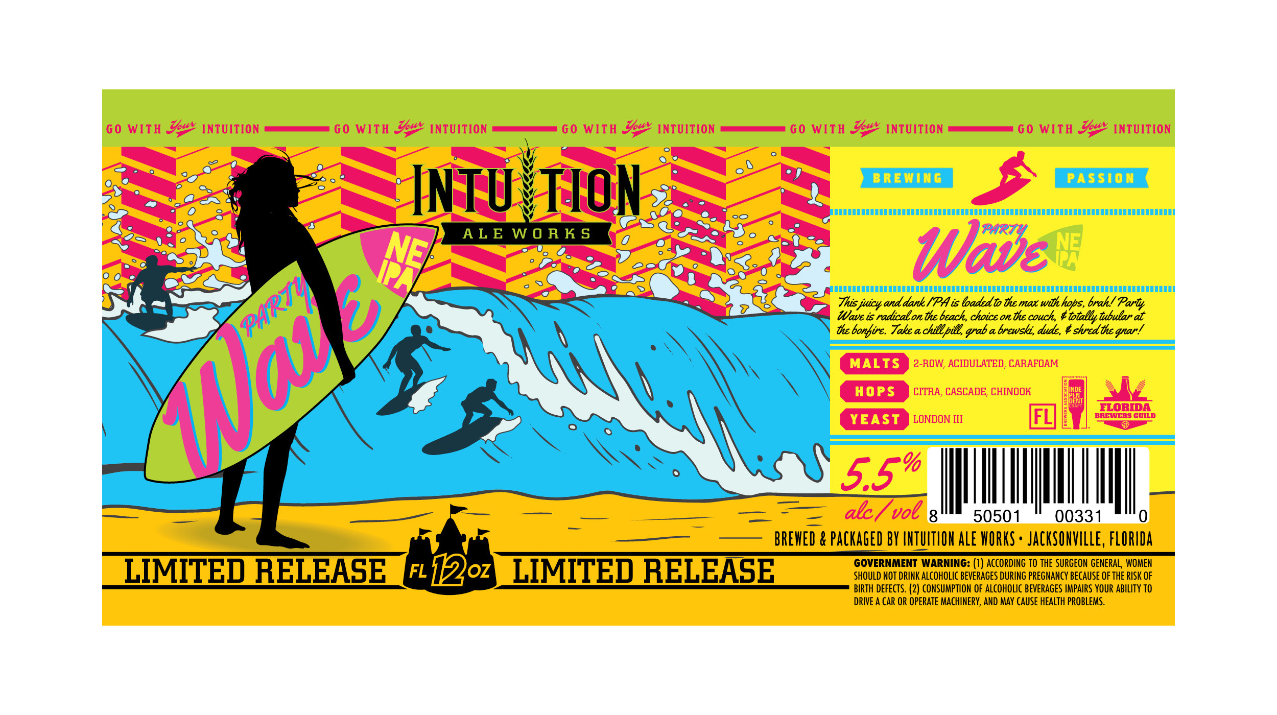
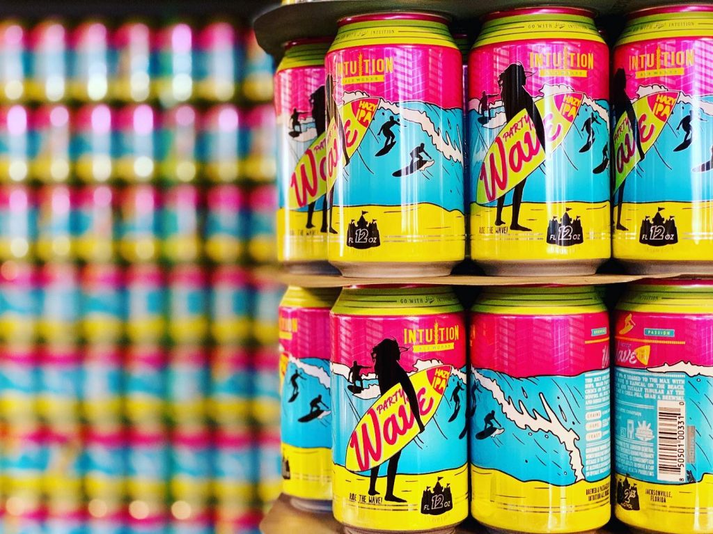
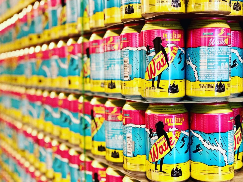
This week will see the first cans of Party Wave Hazy IPA filled on the line at Intuition Ale Works. I know this can looks familiar, but the previous version – the Limited Release version – of this beer was called a New England IPA.
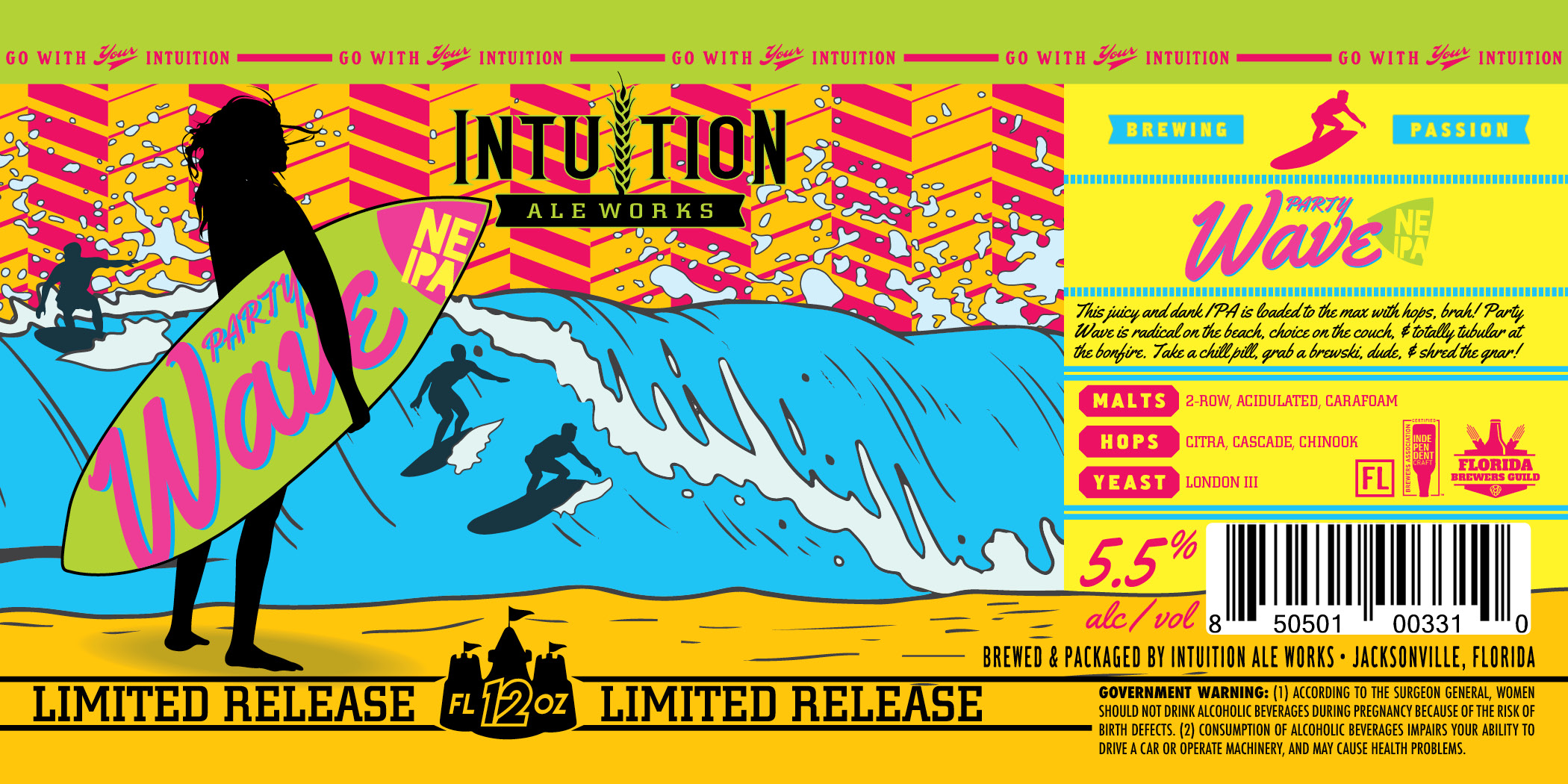
The decision to tweak the recipe and include this incarnation as a core product meant updating the artwork from Limited Release Label to Can Imprint.
The Process
I’m sure you all remember the posting about the process of making the cans. You’ll find it as the only previous post on this blog, actually, so I won’t get into that. We’ll focus on the necessary changes and challenges arising from the shift in production processes. You can see in this comparison slider how different the artwork is from the Label file to Can Imprint file.
Designing for print on a metallic label is surprisingly fun. I suppose it’s that exciting sort of challenge where you get to push yourself to try new things and manipulate a familiar process in different ways.
Designing for ink on paper (or most any other solid substrate) is fairly straightforward: the image is built from the bottom up. That is, when ink is applied to paper, you’re building on top of a neutral (white) base, so you achieve color shades and variants with halftones of the 4 colors on press (Cyan, Magenta, Yellow, & Black). Each of these colors is applied from a separate plate and the overlapping patterns create the colorful images you see in books and magazines. It reminds me of how a group of separate cells works together to create a solid object – you don’t notice the individual parts until you look much closer.
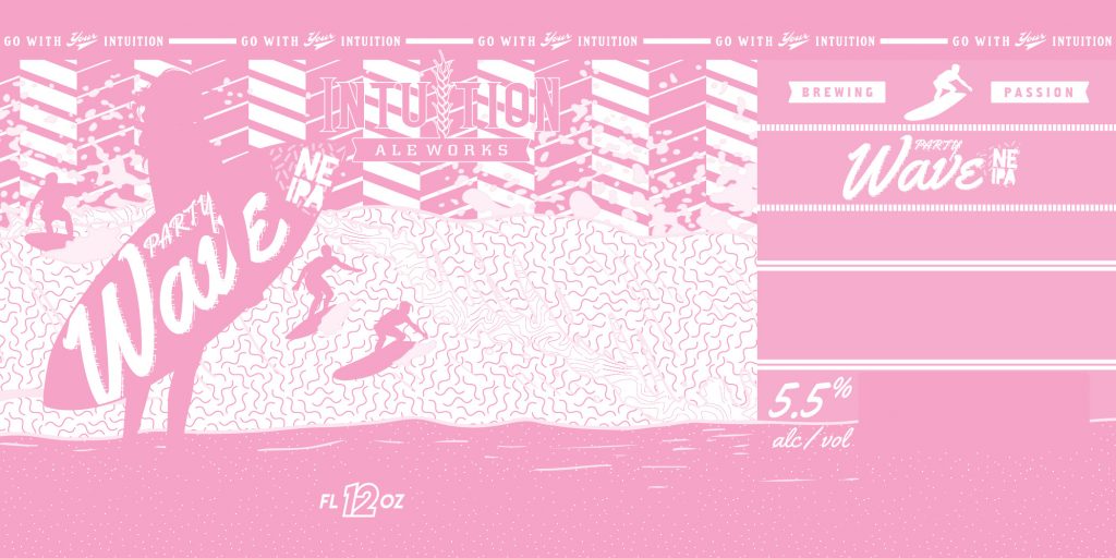
Designing for the metallic substrate of the label is not as easy to convey. In the design you see on screen, the parts that are white will mean – on press – that no ink will be applied. That means they will show through the metallic label below. To combat this, the printer adds 2 layers of white ink to the label as part of their process, which means there are 2 additional layers to design.
Layer 1 of white ink applied to the Party Wave label.
In creating the production artwork for this label, I used pink to represent the white ink. It’s confusing, I know. The white layers print so that the CMYK process of your design will be true to color instead of altered by the gray, reflective substrate. This means, though, that by leaving white off one of both layers, we can make those colors on top appear metallic and reflective!
Take a look at the comparison of production art to printed piece by sliding the arrows back and forth in the image below. Notice how the wave appears as a flat blue in the press file, but because of the pattern of white below has a feeling of depth? That’s fun to work into a design!
The Challenge
Then comes updating the label artwork for a slightly different printing process – direct can imprint.
The can imprint is a 6 color process. That doesn’t mean the usual CMYK plus 2 solids – it means 6 solid inks. It means 6 solid inks from the INX proprietary color catalog. This catalog, by the way, doesn’t match the industry standard Pantone System, so I’ll be accepting donations toward the $2,000 price tag on the catalog order – find me on Venmo & CashApp!
Converting 4 Color Process to 6 Spot colors isn’t the most difficult thing in the world until you realize how many ‘colors’ are actually in the artwork. You can see how things changed in the comparison at the top of the post.
On top of that, there isn’t an option for separate white layers between the metal and inks, some of the effects on the label just don’t work on the can. In this design, we made use of all 6 color channels, including black and white for the surfers and informational panel. The remaining 4 colors make up the water, sand, background, and surfboard/top stripe. In person, on the can, you can see some gradient with metallic underlay in the water and sand, but it’s hard to capture in a photo.
The Payoff
This design was completed and approved back in August, so it’s been a long wait for the product. Weeks of back and forth to match the colors to the proprietary system accurately and get the files in order led to even more delays on the production side. In case you aren’t plugged in to the world of metal imports and exports, there was an aluminum shortage in the last half of 2020 – one more cruel trick the year played on craft beer lovers and microbreweries – and orders were backed up for months!
With these cans finally printed and delivered, the wait wasn’t in vain. Personally, I think these cans are beautiful and I thoroughly enjoyed working on this project. I appreciate the trust from Intuition Ale Works as this design represents a departure from their long established brand. I can’t wait to see this unique canvas on the shelves of stores like Publix soon.


